DESIGN PROCESS
Two types of design:
conceptual – developing conceptual model, captures what the product will do and how it will behave
physical – details of the design, e.g. screen, icons, graphics, menus
To effectively evaluate the design of an interactive product, must produce and interactive versions of the design
PROTOTYPE
A limited representation of a design that allows users to interact with it and to explore its suitability
Allows stakeholders to interact with the envisioned product, gain some experience of using and explore imagined uses
E.g. paper-based storyboards of a system,, cardboard mockup for a desktop laser printer, hyperlinked screens
E.g. PalmPilot’s founder Jeff Hawkin, carry a carved wood about the shape and size of the device to simulate scenarios of use.
WHY PROTOTYPE
Communication device among team members
Test out technical feasibility of an idea
Effective way for user testing/evaluation
Clarifying vague requirements
Check if the design direction is compatible with the rest of the system development
Recommended in software design, to come before any writing of code
TYPES OF PROTOTYPING
LOW FIDELITY PROTOTYPING
The prototype only retains limited characteristics of the final product
They are cheap and quick to produce -
therefore, they support the exploration of alternative
designs (multiple iterations)
They are particularly good for:
Considering early design issues, e.g. layout of controls and display items, sequencing, etc.
Identifying fundamental problems, I.e. those which lead to errors, confusions, major dislikes
Storyboarding
Series of sketches showing how a user might progress through a task using the device being developed
Often based on scenarios - typical activities
involving the product/system in a story form, e.g.
“a patron wants to purchase Harry Potter movie ticket from the cinema, he uses his mobile phone to make the booking while he is on the bus”
Index Card/Stickies:
Each card/sticky represents an element of a task, one screen or a screen element
Used in user evaluations where a member of
the design team “plays the computer”
Difficulties encountered are observed and/or recorded
Advantages:
Lower cost
Evaluate multiple design concepts
Useful communication device
Disadvantages:
Limited error/usability checking
Facilitator driven
Navigational and flow limitations
HIGH FIDELITY PROTOTYPING
Retains many of the characteristics of the final product
Time consuming and expensive to develop, however:
Enable a wider range of usability issues/ problems to be considered/uncovered
Enable other quality attributes such as aesthetics to be evaluated
Impress management, serve as a good marketing and sales tool
3D form with some limited interaction possible
A range of materials may be employed
Very useful when the physical fit/feel of the product is critical, e.g. a handheld device, a wearable device
Software prototyping
Computer-based mock-ups of interface enabling sophisticated user-system interactions
Variety of prototyping tools exist to support developers with differing levels of fidelity, e.g.
MS PowerPoint
Authorware
Macromedia Flash
Macromedia Director
Advantages:
Complete functionality, look and feel of final product
Fully interactive
User-driven
Marketing/sales tools
Disadvantages:
Expensive to develop
Time-consuming to create
Not effective for requirements gathering
COMPARING PROTOTYPING
Step by step detailed lessons and tutorials on Human Computer Interaction and User Profiling (HCIU). Please do not forget to use the LECTURES: Index to access all the lessons in an uniform or whenever required in an indexed manner. The LECTURES : Index is on the right hand side of the page. Thank You.
Wednesday, July 21, 2010
Lecture 8: Usability & Usability Engineering
USABILITY
“Usability: the extent to which a product can be used by specified users to achieve specified goals with effectiveness, efficiency and satisfaction in a specified context of use.”
Why is usability important?
-It makes the difference between performing a task accurately and completely or not, and enjoying the process or being frustrated.
-Determine the success or failure of a system
Poor usability…
-Reduce productivity
-Increase cost time and effort
Usability usually refers to software but is relevant to any product. Some ways to improve usability include:
shortening the time to accomplish tasks,
reducing the number of mistakes made,
reducing learning time,
and improving people's satisfaction with a system.
According to Jakob Nielsen (2003), usability is
defined by 5 quality components :
Learnability : ease of learning for novice users.
Efficiency : steady-state performance of expert users.
Memorability : ease of using system intermittently for casual users.
Errors : error rate for minor and catastrophic errors.
Subjective Satisfaction : how pleasant the system is to use.
LEARNING CURVES
Some systems are designed to focus on learnability.
Others emphasise efficiency for proficient users.
Some support a combination of ease of learning and an “expert mode” (for example rich menus and dialogues plus a command/ scripting language)
DOMAIN AND EXPERTISE
RELATIONSHIP BETWEEN USABILITY GOALS AND USER TYPES
Novice Users:
No or limited knowledge of the occupational task to be performed, and of computers and interface concepts or
Knowledge of the occupational task to be performed, and of computers and interface concepts
Knowledgeable Intermittent Users:
Understanding of the task concepts
Broad knowledge of computers and interface concepts.
Intermittently use the system and may therefore have problems with retention
Expert Frequent (Power) Users:
Thoroughly familiar with both task and interface concepts. They are likely to use the system often and appreciate short cuts to speed their work.
TYPICAL WAYS OF MEASURING USABILITY
Learnability: pick novice users of system, measure time to perform certain tasks.
Distinguish between the various timings taken for some general computer experience.
Efficiency : decide definition of expertise, get sample expert users (which tends to be difficult), measure time taken to perform typical tasks.
Memorability : get sample casual users (who are usually away from system for certain time/duration) and measure time to perform typical tasks.
Errors : count minor and catastrophic errors made by users while performing some specified task.
Satisfaction : ask users subjective opinion (questionnaire, interview), after trying system for real task.
USABILITY ENGINEERING
The term usability engineering describes a process of user interface development, sometimes referred to as user centred design.
It is a lifecycle process that puts an early emphasis on user and task analysis and actual user involvement in the design and testing of a product.
A product developed with such a user centred process is likely to be a more usable product than one that is developed independent of user considerations and involvement.
USABILITY ENGINEERING LIFECYCLE
Identify user requirements and problems
-Profile Users
-Task Analysis
Identify usability goals based on user requirements
Checkout similar products
Design and prototype a solution (involve users)
Evaluate prototype
-Usability testing (real users and real tasks)
Reiterate steps 4-5 …until users are satisfied
Identify user requirements and problems:
Define your user population.
Determine the distribution of skills, knowledge and experience within your user population.
Assess the user’s skill level with respect to both the task and computer domain.
Identify user requirements and problems:
Typical Profile:
-40 % Novice Users
-57 % Knowledgeable/Intermittent Users
-3 % Expert Users
Other Important Information:
-10 % of user population colour blind
-15 % are the elderly
Identify user requirements and problems:
Task analysis allows a designer to identify the goals and purposes of the intended user group.
This used to involve further analysis of user requirements or investigation/observation of customers
Used to guide user interface design
Identify usability goals based:
Learnability, Efficiency, Memorability, Error, Subjective Satisfaction
Decide in advance on usability metrics and desired level of measured usability
E.g.
Check out similar products (Competitive Analysis):
Competitive analysis of software components
Competitive analysis of competing systems
Parallel Design (Explore design alternatives):
designers should work independently, then compare draft designs
Participatory Design:
Have access to pool of representative users.
Guided discussion of prototypes, paper mock-ups, screen designs with representative users.
Applying Guidelines:
Guidelines . . . general principles and advice about usability characteristics of interfaces
Can be intimidating – often hundreds or thousands of specific recommendations.
Prototyping & Testing:
Perform usability evaluation as early as possible in the design cycle by building and evaluating prototypes
Lecture 7: Interaction Techniques
MODELS OF INTERACTION
Norman’s Gulfs of Execution and Evaluation
The user formulates a plan of action, which is then executed at the computer interface. When the plan, or part of the plan, has been executed, the user observes the computer interface to evaluate the result of the executed plan, and to determine further actions
To get something done…
Start with a goal – the goal that is to be achieved
Take action to manipulate something
Check against your goal
MODELS OF INTERACTION-EXECUTION
The seven stages of action
1.Forming the goal
Something to be achieved
E.g. “make a nice meal”
2.Forming the intention
Specific statements of what has to be done to achieve the goal
E.g. “make a chicken casserole using a can of prepared sauce”
3.Specifying an action sequence
The precise sequence of operators that must be performed to effect the intention
E.g. “defrost frozen chicken, open can”
4.Executing an action
Actually doing something
E.g. “opening the can”
5.Perceiving the state of the world
Perceiving what actually happened
E.g. the experience of smell, taste and look of the prepared meal
6.Interpreting the state of the world
Trying to make sense of the perceptions available
E.g. putting those perceptions together to present the sensory experience of a chicken casserole
7.Evaluating the outcome
Comparing what happened with what was wanted
E.g. did the chicken casserole match up to the requirement of “a nice meal”?
INTERACTION STYLE
Dialog between the computer and user.
Identification of interaction styles:
-Command Line Interface
-Menu
-Natural Language
-Question/ answer and query dialogue
-form -fills and spreadsheets
-WIMP
INTERACTION STYLE- COMMANDLINE
First interactive dialog style to be used
A mean of expressing instruction to the computer directly using function keys, single characters, abbreviations or whole word command
user responds to a prompt on the screen by entering an appropriate command
Benefits of command line:
It offers direct access to system functionality
Quick to use.
The command can be applied to many objects at once
Easily extensible
Suitable for experience user
Disadvantages of command line:
Difficult to use
Difficult to learn
Difficult for error correction
Difficult for novice user
Text only data representation
Hint: using consistent and meaningful commands and abbreviations
Design guidelines:
Offer maximum flexibility
-Conduct task analysis to determine the necessary commands
-Facilitate command remembering
Use meaningful, descriptive names
-Use consistent format of the command line
-Provide on-line help
Facilitate error correction
-Give feedback on both successful and unsuccessful commands
INTERACTION STYLE-MENUS
A set of options displayed on screen
Relies on recognition rather than recall
Benefits of Menus:
Easy to use, reduces memorisation
Structure the user’s decisions
Easy to program
Disadvantages of Menus:
Limited choices per menu
Slow to use in large systems
Multi-user systems
-slow response times
Can take up a lot of space
Design guidelines:
Group logically related options
Various categories of grouping:
-Alphabetical
-Categorical
-Conventional
-Frequency
Limit options to 7 per menu approximately, or break into sections
Avoid excessively deep hierarchies
Options that are not available at a given time should be faded (grayed).
INTERACTION STYLE-QUESTIONS AND ANSWERS
Consists of computer prompt, i.e. question, set of choices, and a response from the user.
Next question may depend on previous answer given.
Benefits of Q&A:
Easy to use for naïve and novice users
Conversational systems
Computer initiated and controlled dialogue
Disadvantages of Q&A:
Slow to use
-Time to read
there is limited support for going back to correct errors that might have been made in earlier questions.
Generally they are quite slow to use - every question must be answered in order to get through the sequence
Design guidelines:
Only one question at a time
Re-display previous answer (s) if replies are linked
Keep sequences compatible with source document or user task model
Display format of acceptable responses
INTERACTION STYLE-FORM-FILLS
Designed for clerical workers
Requires little experience with computers
To enable them to carry out repetitive clerical data collection tasks.
Mimicked paper forms in order to retain the characteristics of the manual task
Designed for a specific type or task.
Advantages
-Forms offer a neat, structured way of gathering information.
Disadvantages
-A form has to be designed specifically for each task.
Users will require a certain level of typing skill
Design guidelines:
Text box :
-Maximum size of text-box can be determined beforehand.
In many fields it is possible to provide a default value for a data field
In some forms, certain values might be required, other optional.
-For required items, program might not proceed to other fields until value is entered.
Interdependencies can be incorporated in the program.
-For example, if one element asks if user is pregnant, then 'female' is automatically entered in the 'sex' field.
INTERACTION STYLE-WIMP
Windows, icons, menus and pointers
The user carries out some physical action (e.g. clicking, dragging) rather than typing commands with complex syntax
The results of the action are seen immediately and, usually, actions are reversible
Advantages:
Novices can learn the basic functions quickly, usually through demonstration and practice rather than from formal instruction or a manual.
Intermittent users can retain the main operational concepts of the interface because it involves visual recognition.
Error messages are rarely needed because most actions are reversible.
There is immediate feedback as to whether or not the user's goals have been achieved.
Users are less anxious, again because they know actions can be reversed.
SUMMARY
Interaction is the heart of all modern interfaces and is important at many levels from the ordering of screens to the clicking of a button.
Lecture 6: Usage environment : Computer input and output
ERGONOMICS
Ergonomics
The study of human abilities and characteristics affecting the design of equipment or systems to improve efficiency and safety.
Its role is to define and design tools that are used for different work, leisure and domestic environments to suit the needs and capacities if the user
Repetitive Strain Injury (RSI)
The amount of time spent at the keyboard appears to increase the risk of RSI
with rates above 10,000 keystrokes per hour putting the operator at the highest risk of RSI
Eyes disorders
Loss of visual focus, sore eyes, double vision, seeing different colors, dry eyes, sore, red and watering eyes
The eyes need to be focused at a fixed distance on a vertical image on a bright screen.
This causes the eye muscles to be continually under tension
COMPUTER INPUT-KEYBOARD
QWERTY Keyboard
Designed in 1870s, by Charles Sholes
It is called QWERTY because of the top – left hand keys
Designed to minimize typing speed, in order to prevent frequent jams of the typebars
DVORAK Keyboard
It is arranged on the basis of the frequency usage of letters (in English)
Vowels and frequently – used consonants on the 2nd row
Advantages:
Reduction in finger travel
Consequent improvement in accuracy
Mini Keyboard
Same layout as laptop computer keyboard
Lightweight
Useful for people with restricted arm, hand or finger movement
Big keys LX Keyboard
High contrast black lettering on white large keys
Useful for users with visual impairment
Ergonomics Keyboard
Ergonomic design allows hands and wrists to be held in more comfortable position
Useful for people suffering from RSI (Repetitive Strain Injury)/ carpal tunnel syndrome
Cable Free Keyboard
Keyboard can be used away from desk (range 5 meters)
Useful for wheel chair users
Vertical Split Keyboard
Compatibility: PC, both QWERTY and Dvorak
What is the orthopedic neutral position for the human body?
OTHER TEXT ENTRY DEVICES
HANDWRITING RECOGNITION
Handwritten text can be input into the computer using a pen and a digitizing tablet.
Problems are in capturing useful information, segmenting join up writing into individual letters, interpreting individual letters and copying with different styles of handwriting.
SPEECH RECOGNITION
Promising but only successful in limited situation - single user, limited vocabulary systems.
Problems with:
External noise interfering
Imprecision of pronunciation
Accents
POSITIONING AND POINTING DEVICES
Ergonomics Mouse
Thumb operated mouse
Ergonomic design
Useful for people suffering from RSI as hand remains vertical and strain on wrist and lower arm is reduced
Cable Free Mouse
Light weight
Portable
Useful for wheel chair users
The NoHands Mouse virtually eliminates stress on the delicate hand-wrist area by moving mouse control to the feet!
Trackball
Only a small amount of movement is required to operate a tracker ball
useful for people with restricted movement who find moving the mouse difficult.
Joystick
Can be operated by other parts of the body e.g mouth, foot etc.
Can be used alongside standard mouse
Useful for people with limited motor control
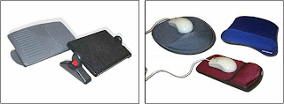
Mouse Tray
Allows the mouse to be put into a comfortable position e.g on leg and there allowing arm to rest in its natural position
Flat working area with cushion on back
Useful for wheel chair users and people with upper limb discomfort
SUMMARY
Interface designer needs to be aware of the properties of the devices with which a system is built
Monday, July 19, 2010
Lecture 5: Design Principles
DESIGN PRINCIPLES
Visibility
Feedback
Constraints
Mapping
Consistency
Affordances
VISIBILITY
This is a control panel for an elevator.
How does it work?
Push a button for the floor you want?
Nothing happens. Push any other button? Still nothing. What do you need to do?
It is not visible as to what to do!
…you need to insert your room card in the slot by the buttons to get the elevator to work!
How to make this action more visible?
make the card reader more obvious ?
provide an auditory message, that says what to do (which language?)
provide a big label next to the card reader that flashes when someone enters?
Other?
VISIBILITY
One of the most important design principles is visibility
Visibility is achieved by placing the controls in a
highly visible location
Designing for visibility means that just by looking, users
can see the possibilities for action
Visibility is often violated in order to make things
"look good"
FEEDBACK
Feedback is the provision of information to a user about the result of an action
When feedback is used in design, the system tells the user that it has done something in response to the user's input
CONSTRAINTS
Constraints are properties of an object that limit the ways in which it can be used
Jigsaws puzzle pieces utilise shape as well as the printed picture/pattern to provide constraints
When constraints are used in design, we reduce the possibility of users making errors
Three main types to represent constraints (Norman, 1999)
Physical
Logical
Cultural
a professor emeritus at University of California, San Diego, works mostly with cognitive science in the domain of usability engineering. Co-founded the Nielsen Norman Group, a consulting group on matters of usability which also includes Jakob Nielsen and Bruce Tognazzini.
CONSTRAINTS-PHYSICAL
The design of floppy disk drives allows the disk to be inserted in the correct way only
The design of video cassette drives allows the cassette to be inserted in the correct way only
Bank card can be inserted in certain way, keys on a pad can only be pressed in certain way. (ATM machine)
CONSTRAINTS-LOGICAL
Where do you plug the mouse and keyboard?
top or bottom connector?
trial and error? experience?
Do the colour coded
icons help?
Do you find them ambiguous? How to design them more logically?
How to design them more logically?
A provides direct adjacent mapping between icon and connector
B provides colour coding to associate the connectors with the labels
CONSTRAINTS-CULTURAL
How to represent Danger!??
Cultural constraints rely on learned conventions
(e.g. red for warning, certain audio signals for danger, smiley face for happy emotions)
Once accepted by more than one cultural groups, they become universally accepted conventions.
Which are universal and which are culturally-specific?
CONSTRAINTS
Restricting the possible actions that can be performed
Helps prevent user from selecting incorrect options
MAPPING
Why is this a poor mapping of control buttons for the sequence of actions of fast rewind, rewind, play and fast forward?
Why is this a better mapping?
NATURAL MAPPING
Mapping is the relationship between controls and their action or effect in the world
Natural mapping takes advantage of physical analogies and cultural standards to provide the user with an understanding of how something works
CONSISTENCY
Design interfaces to have similar operations and use similar elements for similar tasks
For example:
Use of short cut keys
always use ctrl key plus first initial of the command for an operation
– ctrl+C, ctrl+S, ctrl+O
Main benefit is consistent interfaces are easier to learn and use
When consistency breaks down?
What happens if there is more than one command starting with the same letter?
- e.g. save, spelling, select, style
Have to find other initials or combinations of keys, thereby breaking the consistency rule
- e.g. ctrl+S, ctrl+shift+L
Increases learning burden on user, making them more prone to errors
CONSISTENCY (INTERNAL AND EXTERNAL)
Internal consistency refers to designing operations to behave the same within an application
External consistency refers to designing operations, interfaces, etc., to be the same across applications (e.g. MS Office applications) and devices (calculators, remote controls, phone keypads, ATM keypads)
AFFORDANCES
This set of doors connects a walkway between two buildings
Although both sides of both sets of
doors have handles, only the outer
handles are meant to be pulled
Using either set of doors once inside
the walkway, to exit, one needs to
push
Feel trapped??
AFFORDANCES (PHYSICAL)
Physical affordances:
How do the following physical objects afford?
Are they obvious?
AFFORDANCES (LOGICAL)
Virtual affordances (logical)
How do the following screen objects afford?
What if you were a novice user?
Would you know what to do with them?
DESIGN PRINCIPLES REVISITED
Visibility
Placing the controls in a highly visible location
Feedback
provision of information about the result of an action
Constraints
Restricting the possible actions that can be performed helps prevent user from selecting incorrect options
Mapping
Mapping is the relationship between controls and their action or effect in the world
Consistency
Internal consistency refers to designing operations to behave the same within an application
External consistency refers to designing operations, interfaces, etc., to be the same across applications and devices
Affordances
properties of an object that indicate how it can be used
Visibility
Feedback
Constraints
Mapping
Consistency
Affordances
VISIBILITY
This is a control panel for an elevator.
How does it work?
Push a button for the floor you want?
Nothing happens. Push any other button? Still nothing. What do you need to do?
It is not visible as to what to do!
…you need to insert your room card in the slot by the buttons to get the elevator to work!
How to make this action more visible?
make the card reader more obvious ?
provide an auditory message, that says what to do (which language?)
provide a big label next to the card reader that flashes when someone enters?
Other?
VISIBILITY
One of the most important design principles is visibility
Visibility is achieved by placing the controls in a
highly visible location
Designing for visibility means that just by looking, users
can see the possibilities for action
Visibility is often violated in order to make things
"look good"
FEEDBACK
Feedback is the provision of information to a user about the result of an action
When feedback is used in design, the system tells the user that it has done something in response to the user's input
CONSTRAINTS
Constraints are properties of an object that limit the ways in which it can be used
Jigsaws puzzle pieces utilise shape as well as the printed picture/pattern to provide constraints
When constraints are used in design, we reduce the possibility of users making errors
Three main types to represent constraints (Norman, 1999)
Physical
Logical
Cultural
a professor emeritus at University of California, San Diego, works mostly with cognitive science in the domain of usability engineering. Co-founded the Nielsen Norman Group, a consulting group on matters of usability which also includes Jakob Nielsen and Bruce Tognazzini.
CONSTRAINTS-PHYSICAL
The design of floppy disk drives allows the disk to be inserted in the correct way only
The design of video cassette drives allows the cassette to be inserted in the correct way only
Bank card can be inserted in certain way, keys on a pad can only be pressed in certain way. (ATM machine)
CONSTRAINTS-LOGICAL
Where do you plug the mouse and keyboard?
top or bottom connector?
trial and error? experience?
Do the colour coded
icons help?
Do you find them ambiguous? How to design them more logically?
How to design them more logically?
A provides direct adjacent mapping between icon and connector
B provides colour coding to associate the connectors with the labels
CONSTRAINTS-CULTURAL
How to represent Danger!??
Cultural constraints rely on learned conventions
(e.g. red for warning, certain audio signals for danger, smiley face for happy emotions)
Once accepted by more than one cultural groups, they become universally accepted conventions.
Which are universal and which are culturally-specific?
CONSTRAINTS
Restricting the possible actions that can be performed
Helps prevent user from selecting incorrect options
MAPPING
Why is this a poor mapping of control buttons for the sequence of actions of fast rewind, rewind, play and fast forward?
Why is this a better mapping?
NATURAL MAPPING
Mapping is the relationship between controls and their action or effect in the world
Natural mapping takes advantage of physical analogies and cultural standards to provide the user with an understanding of how something works
CONSISTENCY
Design interfaces to have similar operations and use similar elements for similar tasks
For example:
Use of short cut keys
always use ctrl key plus first initial of the command for an operation
– ctrl+C, ctrl+S, ctrl+O
Main benefit is consistent interfaces are easier to learn and use
When consistency breaks down?
What happens if there is more than one command starting with the same letter?
- e.g. save, spelling, select, style
Have to find other initials or combinations of keys, thereby breaking the consistency rule
- e.g. ctrl+S, ctrl+shift+L
Increases learning burden on user, making them more prone to errors
CONSISTENCY (INTERNAL AND EXTERNAL)
Internal consistency refers to designing operations to behave the same within an application
External consistency refers to designing operations, interfaces, etc., to be the same across applications (e.g. MS Office applications) and devices (calculators, remote controls, phone keypads, ATM keypads)
AFFORDANCES
This set of doors connects a walkway between two buildings
Although both sides of both sets of
doors have handles, only the outer
handles are meant to be pulled
Using either set of doors once inside
the walkway, to exit, one needs to
push
Feel trapped??
AFFORDANCES (PHYSICAL)
Physical affordances:
How do the following physical objects afford?
Are they obvious?
AFFORDANCES (LOGICAL)
Virtual affordances (logical)
How do the following screen objects afford?
What if you were a novice user?
Would you know what to do with them?
DESIGN PRINCIPLES REVISITED
Visibility
Placing the controls in a highly visible location
Feedback
provision of information about the result of an action
Constraints
Restricting the possible actions that can be performed helps prevent user from selecting incorrect options
Mapping
Mapping is the relationship between controls and their action or effect in the world
Consistency
Internal consistency refers to designing operations to behave the same within an application
External consistency refers to designing operations, interfaces, etc., to be the same across applications and devices
Affordances
properties of an object that indicate how it can be used
Lecture 4: User Profiling
USER
“One most unfortunate product is the type of engineer who does not realize that in order to apply the fruits of science for the benefit of mankind, he must not only grasp the principles of science, but must also know the needs and aspirations, the possibilities and the frailties, of those whom he would serve.”
-- Vannevar Bush
1890-1974, well known
American Electrical engineer
Directed programs like the first development of atomic bombs , mass production of penicillin
WHAT IS USER PROFILING
The process of establishing knowledge about the users
Find out who users are: Children, Elderly, Professional, Scientist, Male, Female, Tech Savvy, IT Illiterate
what is the goal in using the product:Withdraw cash, pay bills, find out movie time, online chat, gaming, research, cook, wash, treatment
what are the tasks involved? (observe existing work practices):E.g. To apply for leave: check schedule, get leave application form from admin, fill in the form, get supervisor to approve, get manager to approve, inform scheduler, inform colleagues, go on leave.
WHY DO USER PROFILING
System will fail if it -
does not do what the user needs
is inappropriate to the user
“the system must match the users’ tasks and must meet the requirements”
Why do user profiling, why not define “good” interfaces and just based your design on them?
infinite variety of tasks and users
guidelines can be too vague to be generative
e.g., “give adequate feedback”, or “make the system enjoyable”
– how do you define and relate to users?”
WHY DO WE WANT TO KNOW-WHO ARE THE USERS
Identify attributes of users:
Physical characteristics:
height; physical abilities or disabilities
Background:
education; social; religious
Skills:
task experience
Preferences:
efficiency
WHY DO WE WANT TO KNOW-WHERE IS THE TASK PERFORMED
Office, laboratory, POS? (while standing, while sitting, in a crowded place, effects of environment)
Are users under stress? (in an operation theatre)
Is confidentiality required? (information displayed)
Do Users have wet hands? (at the butcher)
Do Users consume drinks while doing tasks?
What kind of lighting do they work under?
Surrounding noise
WHY DO WE WANT TO KNOW-RELATIONSHIP BETWEEN USER AND DATA
Personal data
always accessed at same machine?
do users move between machines?
Common data
used concurrently?
Passed sequentially between users?
Access to data restricted?
WHAT DO WE WANT TO KNOW-HOW OFTEN ARE TASKS PERFORMED
Frequent users remember more details
Infrequent users may need more help
even for simple operations
Which function is performed
most frequently?
by which users?
optimize system for these tasks will improve perception of good performance
WHAT DO WE WANT TO KNOW-WHAT ARE THE TIME CONSTRAINTS
What functions will users be in a hurry for?
Positioning of functions
Which can wait?
Is there a timing relationship between tasks?
Time out
USER REQUIREMENT
Captures the characteristics of the intended user group
Novice & Casual (clear step by step intro)
Expert & Frequent (flexible interactions, wide range of power/control, short cut keys)
Analyse the results of user profiling and identify the impact to your interface design
Know your users – always!
DATA GATHERING
What:
How do we go about determining requirements
and concluding the results
An important part of the requirement activity
and also evaluation activity
Why:
Purpose is to collect sufficient, relevant and
appropriate data to produce a set of reliable
requirements/conclusions.
DATA GATHERING TECHNIQUES
Questionnaires
A series of questions designed to elicit specific information
Can give quantitative and qualitative data
Administered at distance, no one to explain & help in answering
Advantages, disadvantages
Interviews
Involves asking someone a set of questions (often f2f)
Good for exploring issues, encourage people to respond
Advantages, disadvantages
Workshops or focus groups
Group interviews rather than one on one
Gain a consensus view and/or highlighting areas of conflicts
Facilitator is required to keep conversation on track
Has to be carefully structured, participants have to be carefully chosen
Advantages, disadvantages
Naturalistic observation
Spend time with stakeholders in their day to day tasks, observing work as it happens
Good for understanding the nature and context of the tasks
Take notes, ask question (not too many)
Variation of this - ‘Ethnography’
Observing from the ‘inside’ as a participant, full involvement
Advantages, disadvantages
Studying documentation
Good for getting background information on procedures and rules (manuals, job logs)
Advantages, disadvantages
PROBLEMS WITH DATA GATHERING
Identifying and involving stakeholders
Availability of key people
Communication between parties
Within development team (more technical)
With customer/user (less technical)
Between users (different parts of an organisation use different terminology
e.g. End of Module Report for APIIT vs Module Report for SU)
Dominance of certain stakeholders
Balancing functional and usability demands
QUESTIONNAIRE DESIGN
Keep questions short
Only ask a question if it contributes to design
Use closed questions for ease of analysis
Always pilot questionnaires/interview schedules
SUMMARY
Keep questions short
Only ask a question if it contributes to design
Use closed questions for ease of analysis
Always pilot questionnaires/interview schedules
Lecture 3: Human Factors
UNDERSTANDING USERS
System User
Individual user, a group of users working together or a sequence of user in organization each dealing with some part of the task or process.
Hint: Users are limited in their capacity to process information
In order to design, it is important to understand the capabilities and limitations of those we are designing for.
HUMAN FACTORS-PHYSIOLOGY
Physical make – up, capabilities
Eg. Keyboard keys cannot be smaller than finger size
Left or right handed?
Movement
Disabilities
HUMAN FACTORS-COGNITION
What goes in our heads when we carry out our everyday activities
Thinking, reasoning, problem solving, memory
The HCI objective is to understand the interaction between humans and computers in terms of how knowledge is transmitted between the two
Attention
Process of selecting things to concentrate on at a point in time
Depends on:
Our goals
If we know exactly what we want to find out, we try to match this with the information that is available
Information presentation
Greatly influence how easy or difficult it is to appropriate pieces of information
Try to read the paragraph below…
According to a rscheearch at Cmabrigde Uinervtisy, it deosn't mttaer in waht oredr the ltteers in a wrod are, the olny iprmoetnt tihng is taht the frist and lsat ltteer be at the rghit pclae. The rset can be a total mses and you can sitll raed it wouthit porbelm. Tihs is bcuseae the huamn mnid deos not raed ervey lteter by istlef, but the wrod as a wlohe and the biran fguiers it out aynawy.
Read the lists below, cover it up, and then try to recall as many of the items as possible
3, 12, 6, 20, 15, 49, 81, 76, 8, 97, 13, 56
Cat, house, paper, laugh, people, red, yes, number, shadow, broom, rain, plant, lamp, chocolate, radio, one, coin
T, k, y, w, n, o, c, d, e, q, p, r
According to George Miller’s (1956) theory, 7 ± 2 chunks of information can be held in short – term memory at any time.
How to apply this in interface design?
Design tips…
Have only 7 options on a menu
Display only 7 icons on a menu bar
Place only 7 items on a pull down menu
HUMAN FACTORS-PERCEPTION
How a person perceives what input they get through their senses
Capabilities and limitation of visual processing and understand how we perceive size and depth, brightness and colour
Is the left center circle bigger than the right center circle?
METAPHORS
A conceptual model that has been developed to be similar in some way to the aspects of a physical entity.
Maps elements of the real world on to elements of the system world
Dragging a document icon across the desktop screen was seen as equivalent to picking up a piece of paper in the physical world and moving it.
Benefits of using metaphors
Easier to learn because it is familiar to user
Enables learning by building upon existing knowledge
Provide a powerful way of learning the complexity of a system
A short cut to complete concepts
Disadvantages of metaphor
Breaks the rules
Recycle bin that sits on the desktop
Logically and culturally, it should be placed under the desk
If follow the same rule, user would not be able to see the bin because it would be occluded by the desktop surface
Too constraining
Restricting the kinds of computational tasks that would be useful at the interface
Disadvantages of metaphor
Too constraining
Restricting the kinds of computational tasks that would be useful at the interface
Open a file that is embedded in several hundreds of files in a directory
Inefficient if scanning through 100++ files
Instruct a command to open the desired file by typing in its name
Limits the designer’s imagination
Disadvantages of metaphor
Conflicts with design principles
Not able to understand the system function beyond the metaphor
Overly literal translation of existing bad designs
Virtual calculator which designed to look and behave like a physical calculator
Physical calculator has been poorly designed with excessive use of modes, poor labeling of functions and difficult to manipulate key sequences
STAKEHOLDER
Defined as anyone who is affected by the success and the failure of the system
CATEGORIES OF STAKEHOLDER
Primary
Those who use the system
Secondary
Those who don’t directly use the system but receive the output from it
Someone who receive reports from the system
Tertiary
Those who do not fall into 1 and 2 but who are affected by the success or failure of the system
A director whose profits increase or decrease depending on the success of the system
Facilitating
Those who are involved in designing, developing and maintaining the system
CLASSIFYING STAKEHOLDERS
Classifying stakeholders - An Airline Booking System
“An international airline is considering introducing a new booking system for use by associated travel agents to sell flights directly to the public”
Primary Stakeholders:
Travel Agency staff, airline booking staff
Secondary Stakeholders:
Customers, Airline management
Tertiary Stakeholders:
Competitors, Civil aviation authorities, Airline Shareholders
Facilitating Stakeholders:
Design team, IT Department staff
SUMMARY
We must understand what is the strength and limitation of a user before we start to design any system.
A good system will be able to increase the effectiveness and efficiency of users and is able to accommodate a wide range of user
Sunday, July 18, 2010
Lecture 2: Overview
WHAT IS HCI
HCI is concerned with the design, evaluation and implementation of interaction computing systems for human use and with the study of major phenomena surrounding them.
HUMAN
Individual user, a group of users that work together
A sequence of user in an organization each dealing with some part of the task or process.
They use technology
COMPUTER
Any technology ranging from the general desktop to a large scale computer system, a process control or an embedded system
INTERACTION
Communication between user and computer
WHY BOTHER
WHY SYSTEMS FAIL
16% of the projects are successful
31% are partially successful
53% of projects failed
Inadequate requirements 13%
Lack of user participation 12%
Inadequate resources 11%
Unrealistic expectations 10%
Lack of support at senior level 9%
Changing specification 8%
Lack of planning 8%
Failure is overwhelming due to human rather than technical factors
COMMON ISSUES IN USER INTERFACE DESIGN
Software developers are forced to “do it all”
Often based on intuition and experience than on theory-based models
Tendency to let the art of interface design beats its usability
Often results in inconsistent features that do not fit into a good user interface design criteria
WHY STUDY HCI (Human Computer Interaction)
Business view :
to employ people more productively and effectively
- people costs now far outweigh hardware and
software costs
people now expect “easy to use” systems
- generally they are not tolerant of poorly designed
systems
- if a product is hard to use, they will seek other
products
Human Factors view :
humans have limitations. Errors are costly in terms of
- loss of time & money
- loss of lives in critical systems
- loss of morale
SCOPE OF HCI, MANY SURROUNDING FACTORS
HCI is a very broad discipline that encompasses
Different specialties with different concerns regarding
computer development
All the discipline that related to HCI…
Psychology and cognitive science (give the knowledge of user’s perceptual, Cognitive and problem solving skills, ergonomics for the user’s physical capabilities)
Sociology and organization psychology (understand the wider context of the interaction)
Computer science and engineering (build the necessary technology)
Business (marketing)
Graphic (effective interface presentation)
Technical (produce user manual)
THE GOAL OF HCI
To design computer systems that support people so that they can carry out their activities productively and safely
To develop or improve the safety, utility and effectiveness of systems that include computers, often through improving usability.
To improve…
Safety
Utility (functionality)
Effectiveness (do the right thing)
Efficiency (do things right)
Usability
simplicity
WHAT IS USABILITY
Usability can simply be thought of as the practical implementation of good HCI, but, more formally :
Usability means easy to learn, effective to use and providing an enjoyable experience
HOW TO DESIGN AND USE USABLE USER INTERFACES
UI Development process :
User Profiling
Usability goals
Task analysis & contextual inquiry
Prototyping
Evaluation
Programming
USER INTERFACE DEVELOPMENT PROCESS
SUMMARY OF MAIN TEACHING POINTS
HCI must be taken seriously by designers if the requirement for additional complexity in the system is to be matched by increased clarity and usability in the interface
Subscribe to:
Posts (Atom)